“A Coney Island institution for nearly 100 years, Nathan's Famous Frankfurters has left an indelible imprint on the collective memory and palate of New York and its visitors. Director and grandson of ‘Famous’ Nathan himself, Lloyd Handwerker takes a look back at his family history, the immigrant experience, and Nathan’s pursuit of the American dream through this personal narrative gem. Broadening the scope of Nathan’s history is a colorful cast of family members and priceless characters from Coney Island. Featuring beautiful home movie footage, rare archival material, and a bold editing style, Famous Nathan will not disappoint New York history enthusiasts.” -Dan Hunt, Tribeca Film Festival
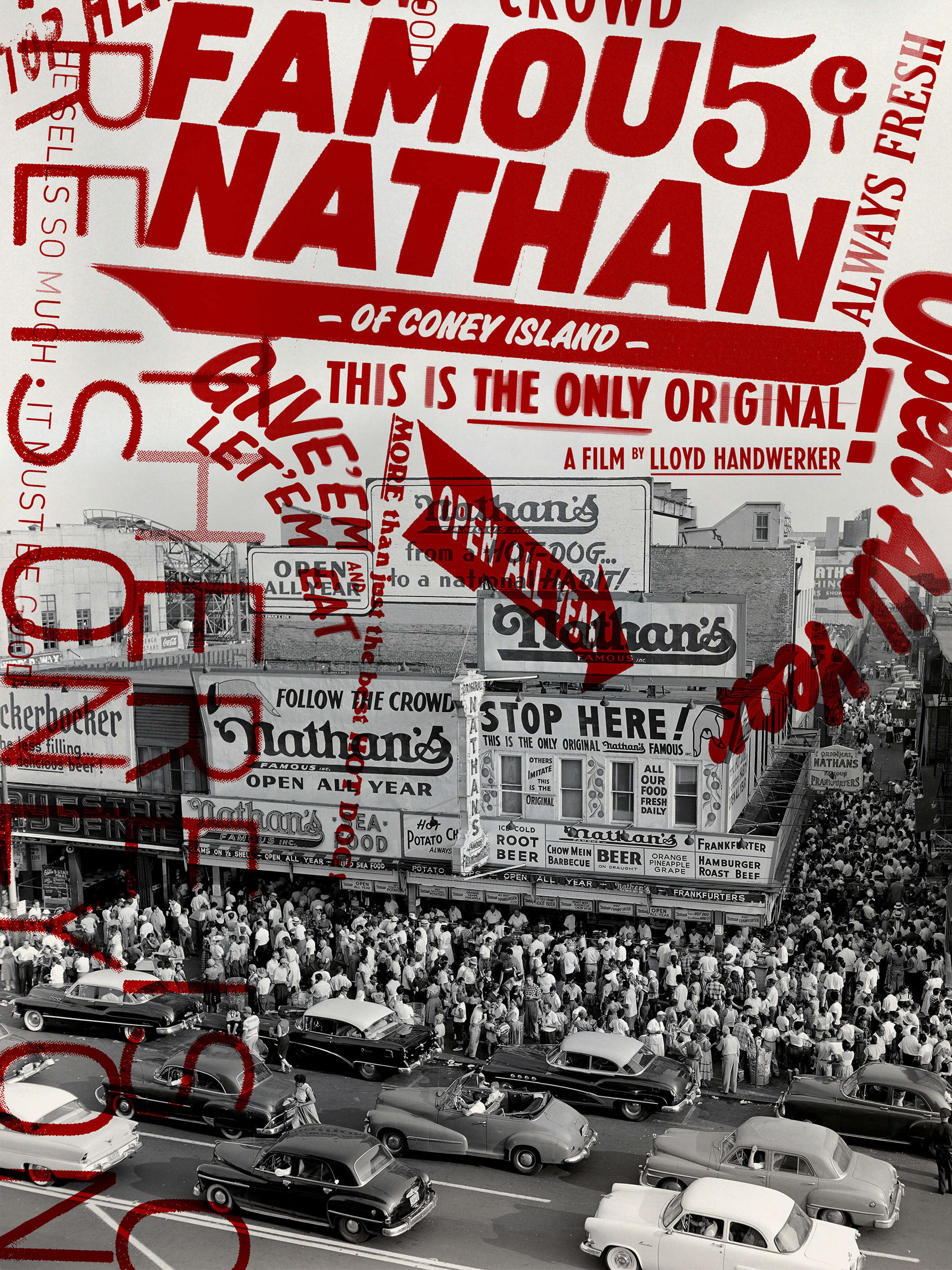
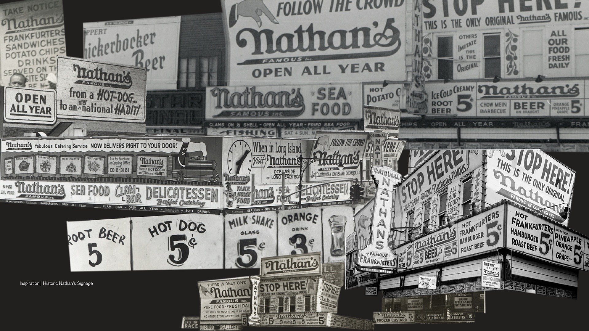
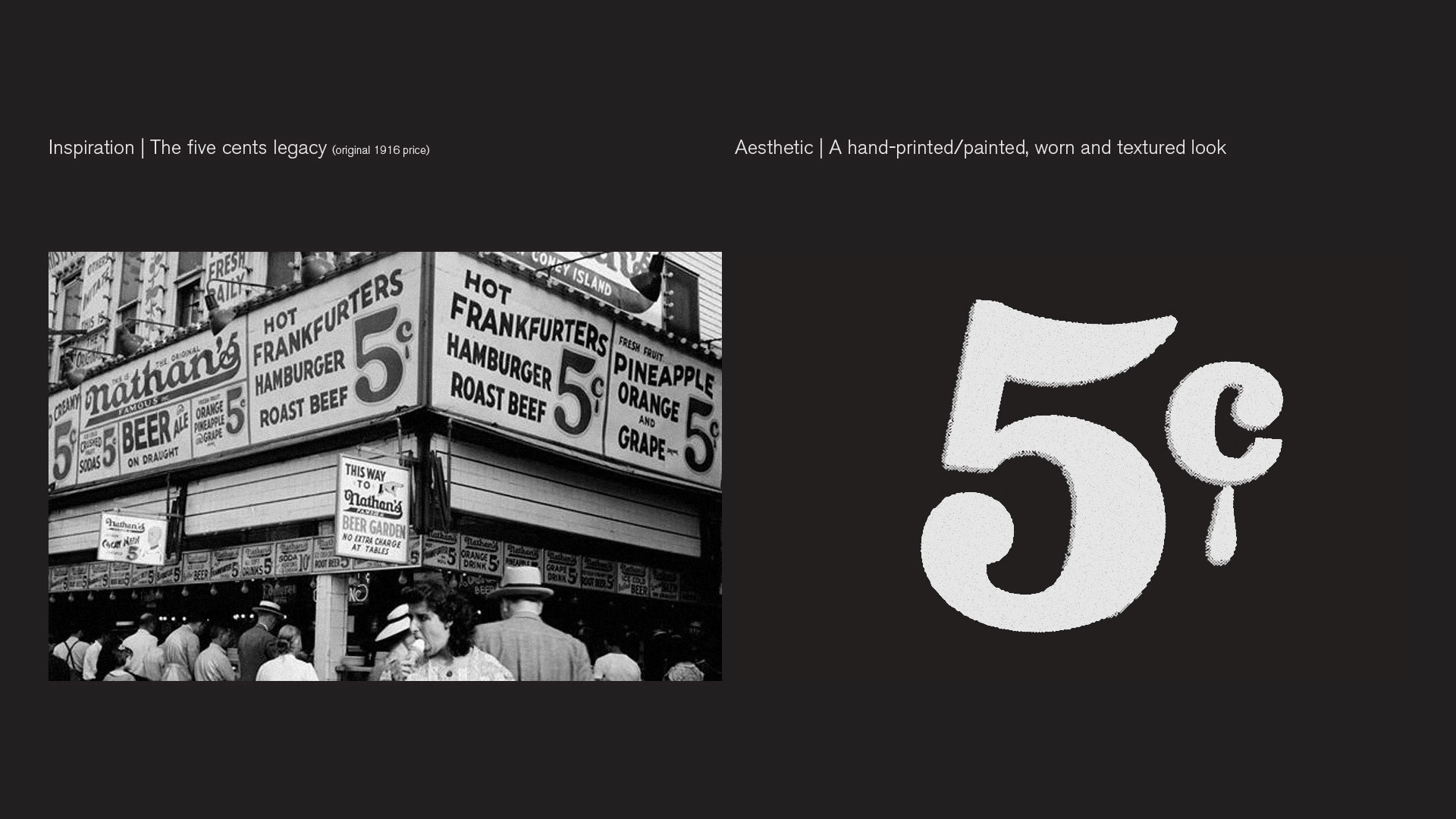
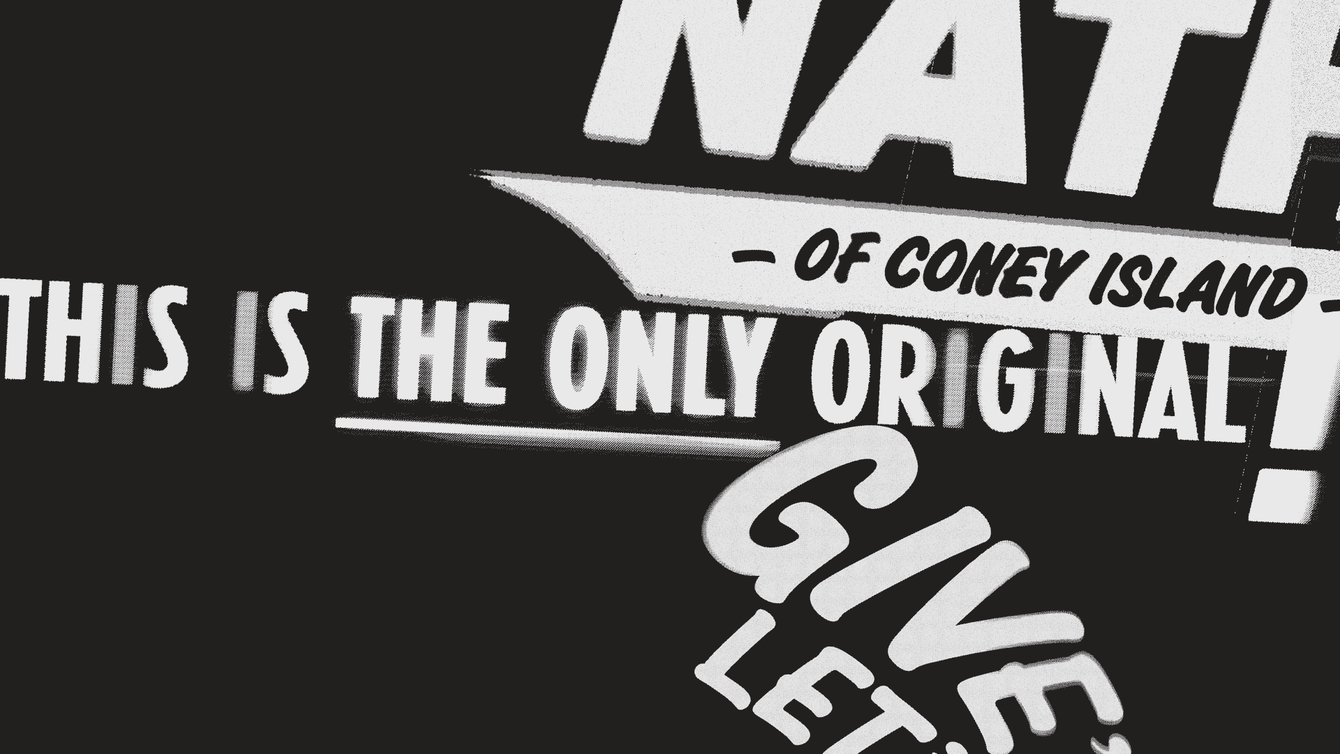
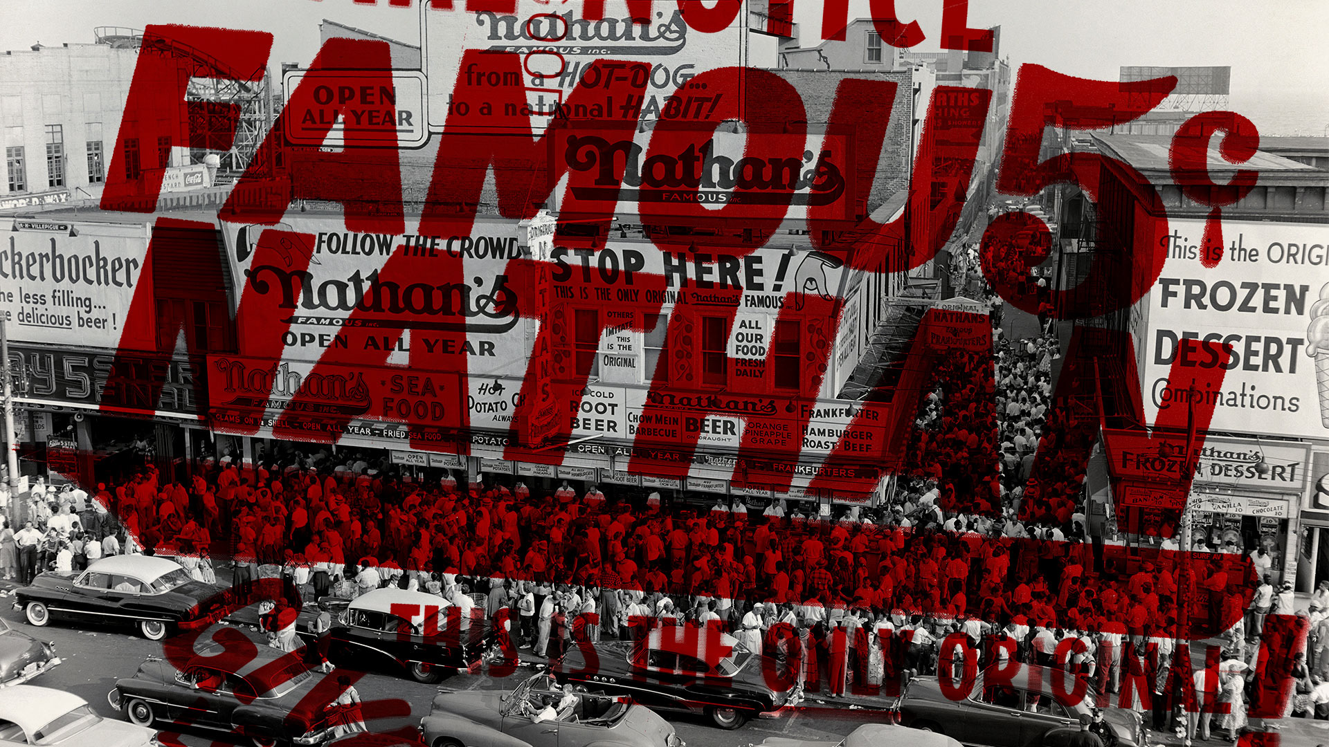
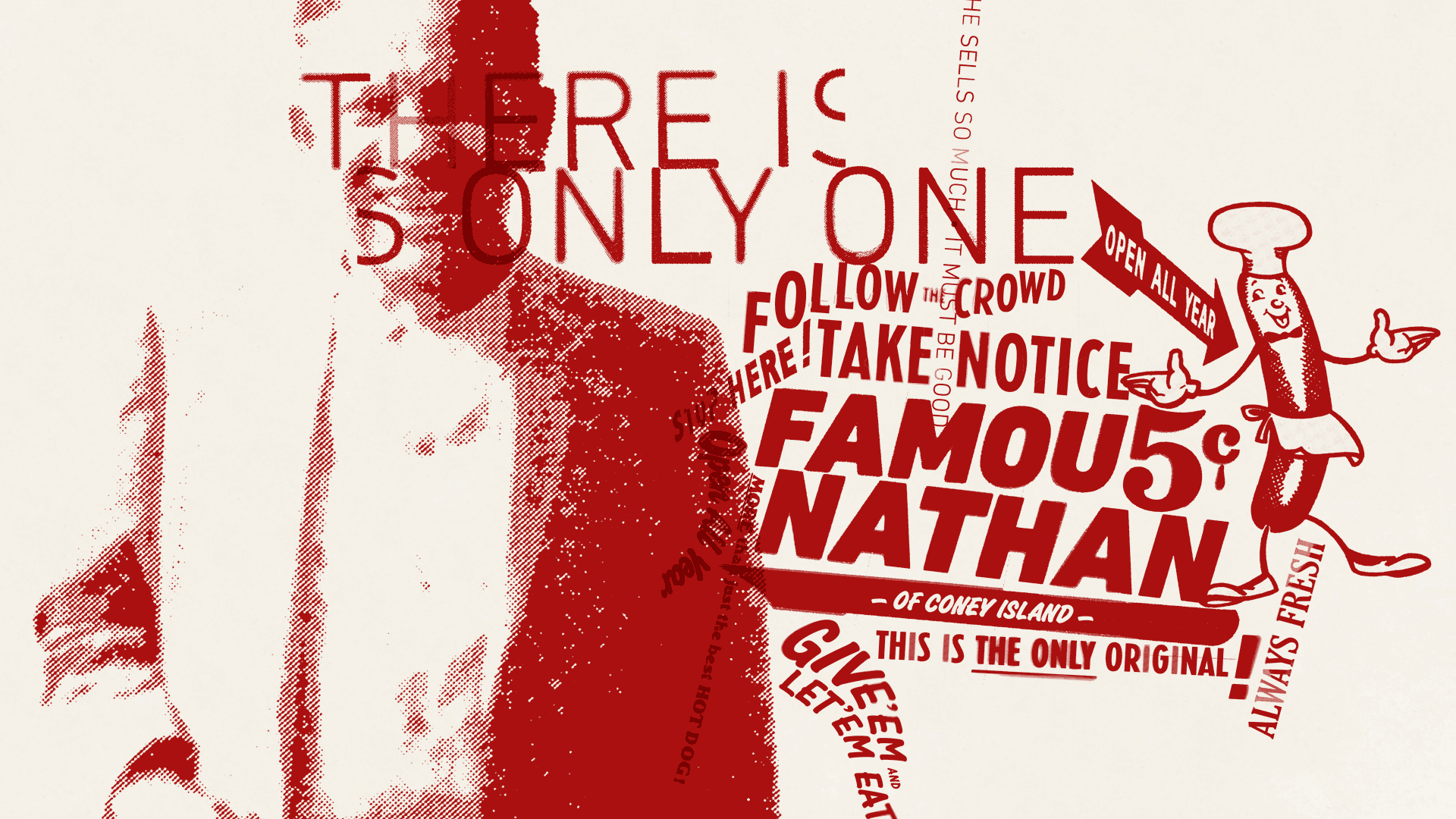
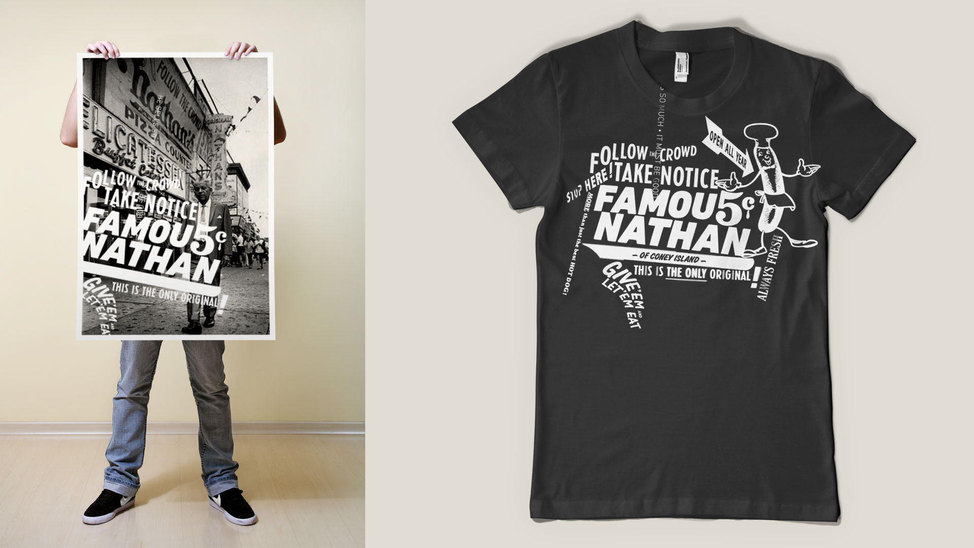
Inspired by historic visual vernacular of the original Nathan’s Famous, the identity system is focused on typography featured in exterior signage, menus and surrounding businesses ethos during the beginning years of Nathan's, along with gleaning key elements from the look/feel of the business which was later to come.
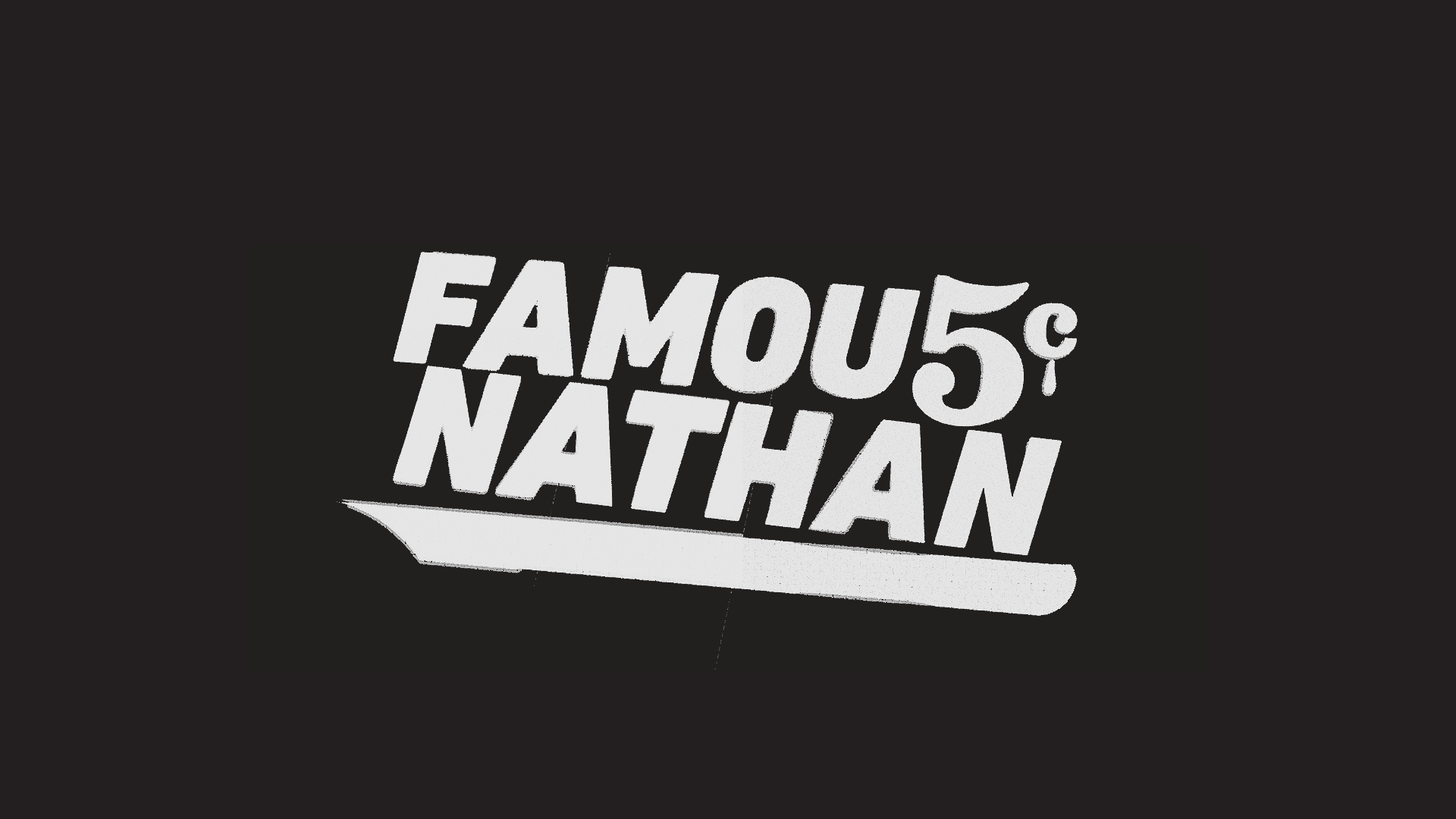
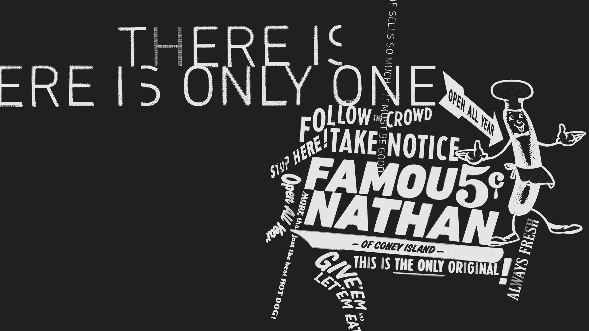
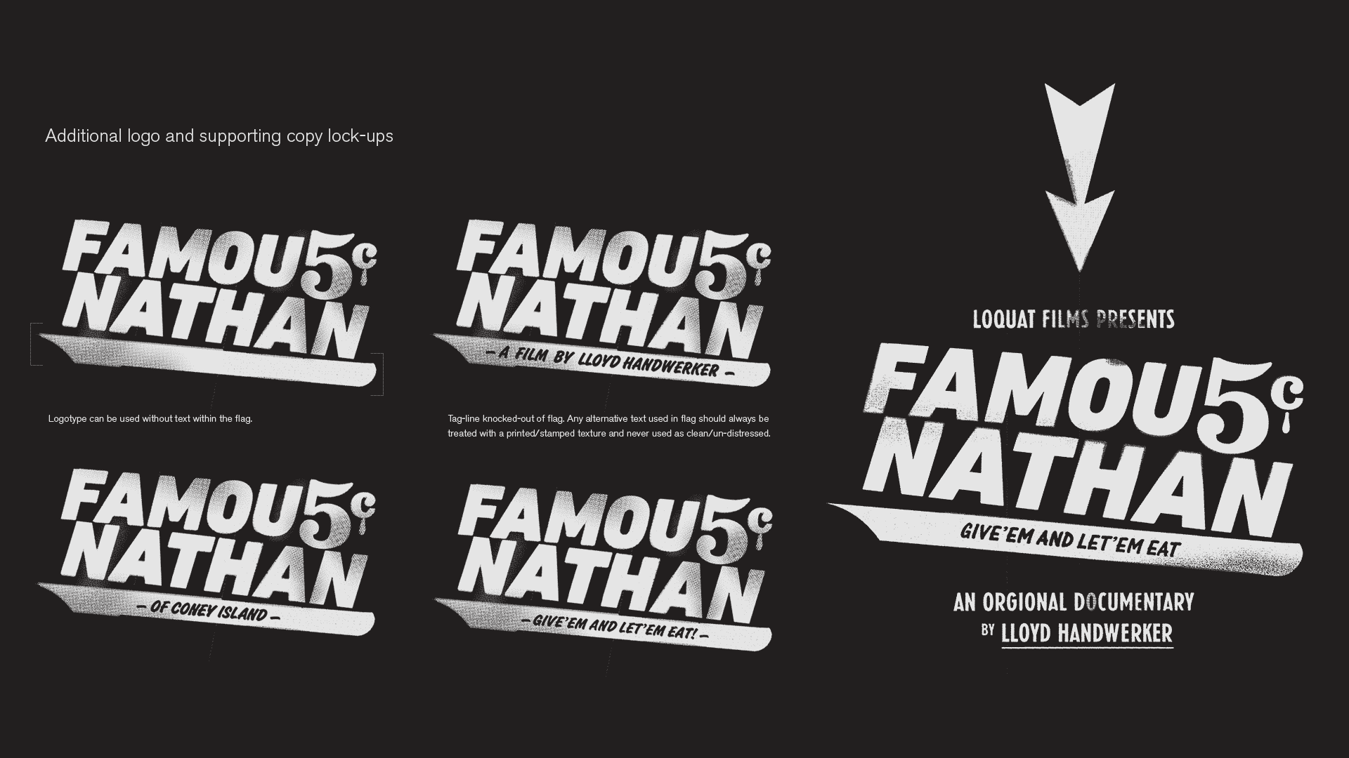
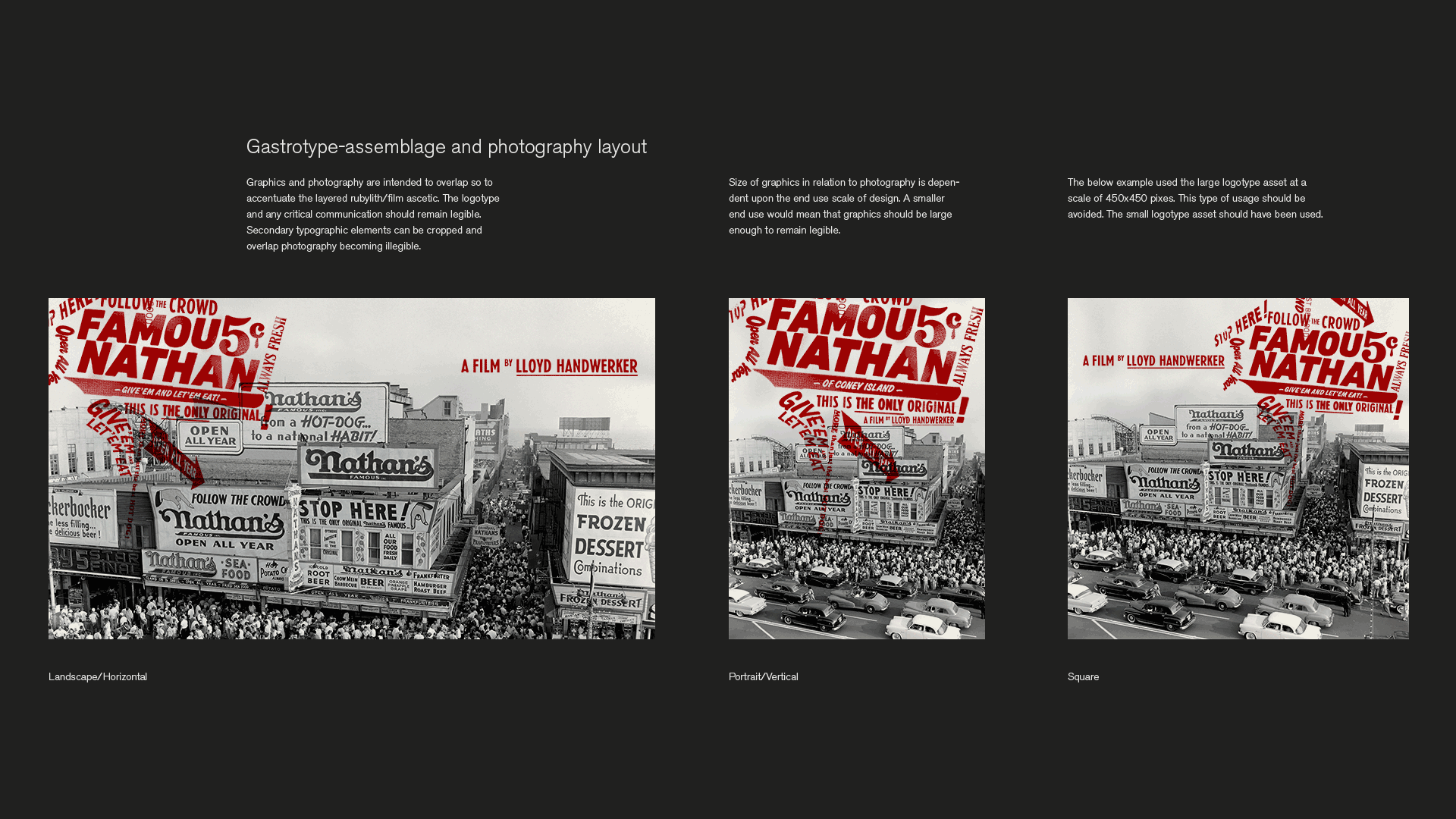
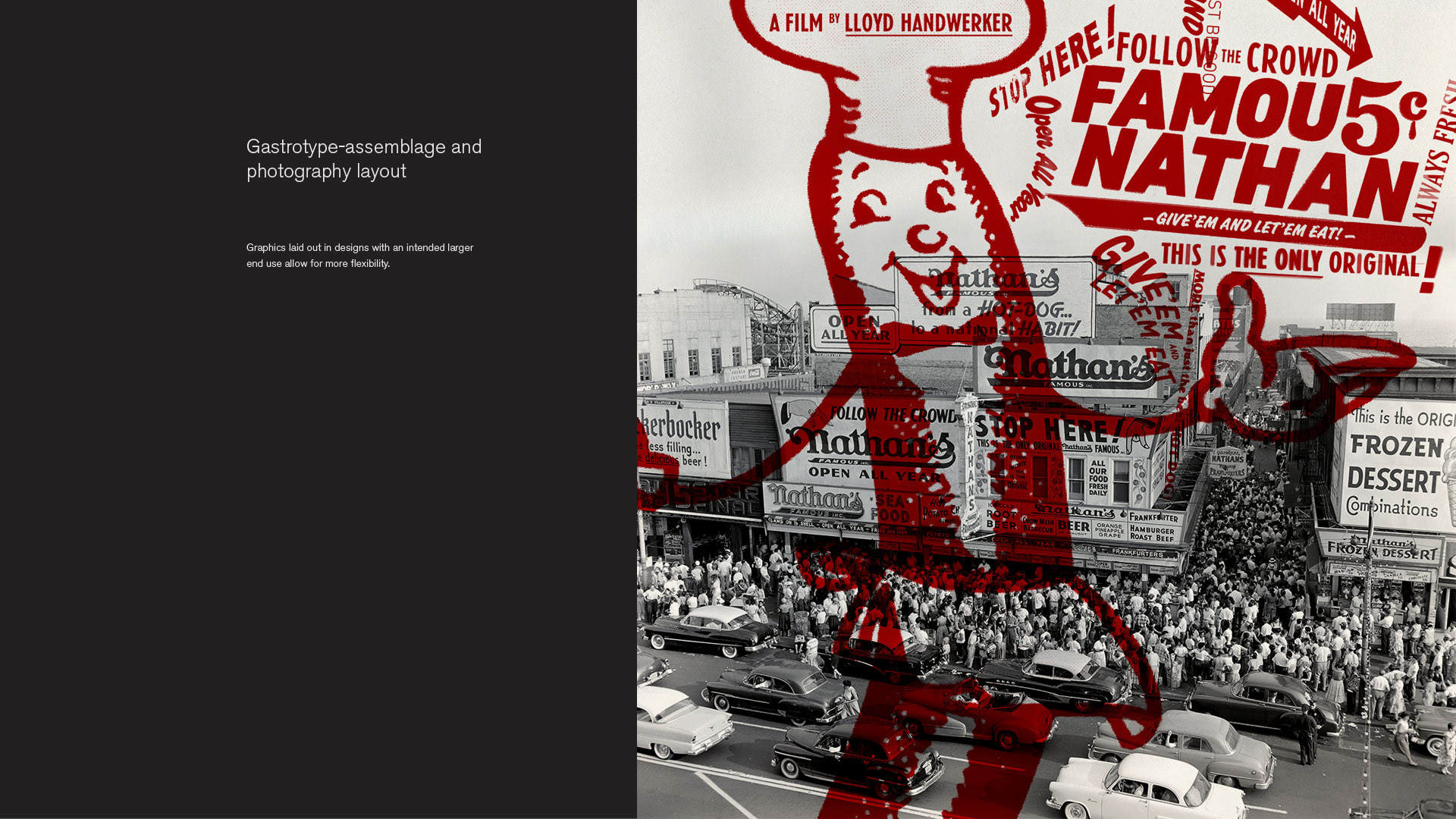
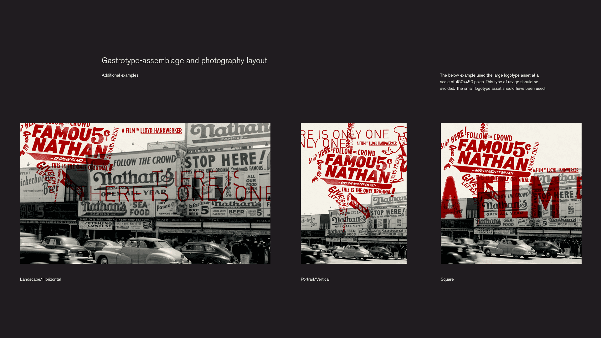
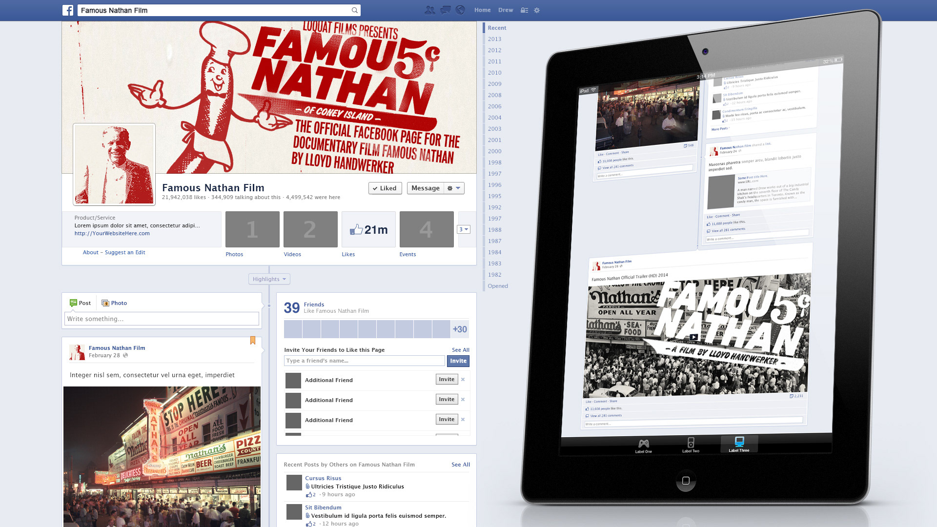
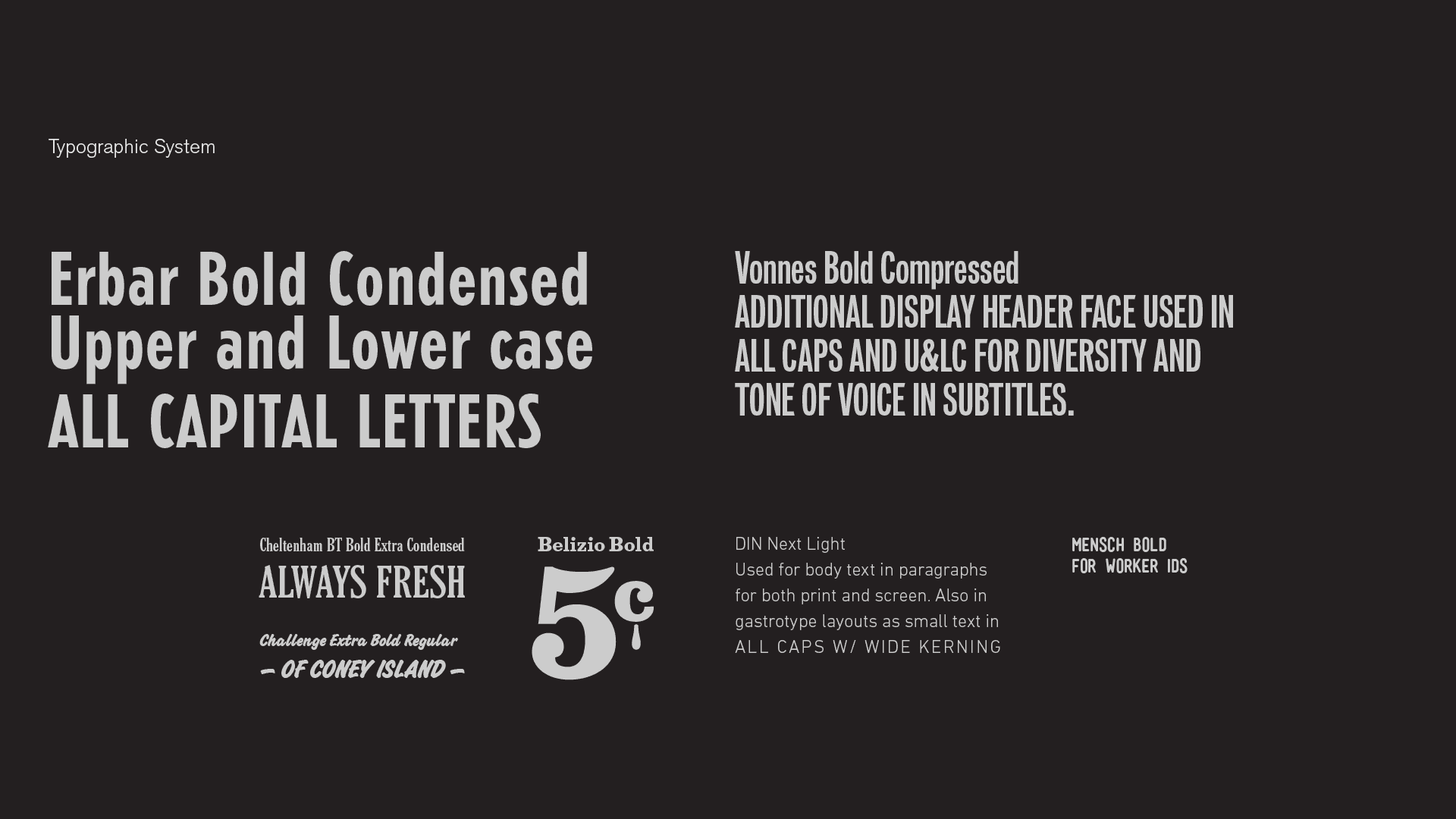
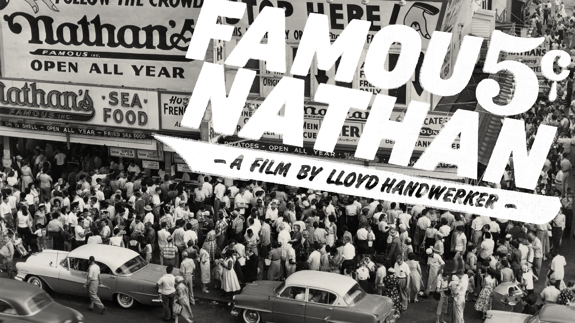
The “Famous Nathan” identity system created by GRAPHIC HAVOC consists of a primary logotype, secondary language & gastrotype-assemblage, additional logo and copy lock-ups, color palette, photographic style/treatment guidelines, typographic specifications, compositing and motion design guidelines, along with example marketing communication materials.
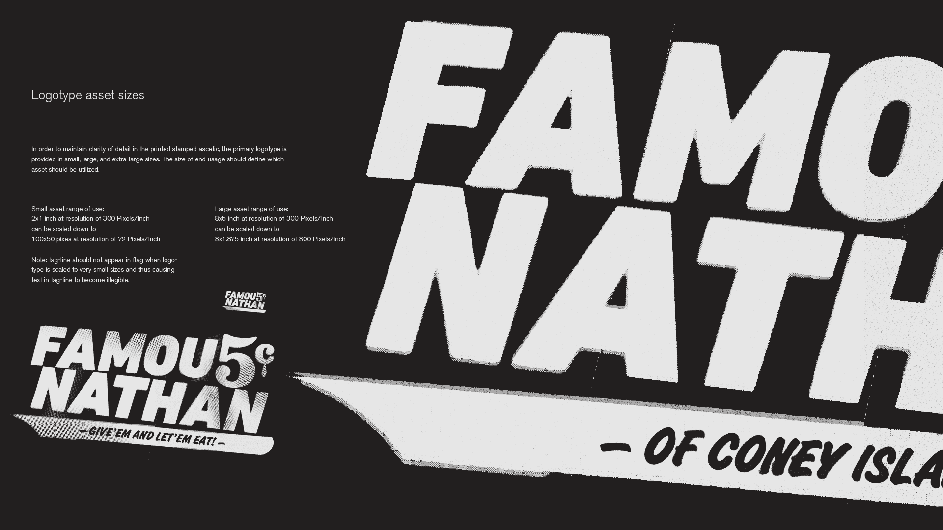
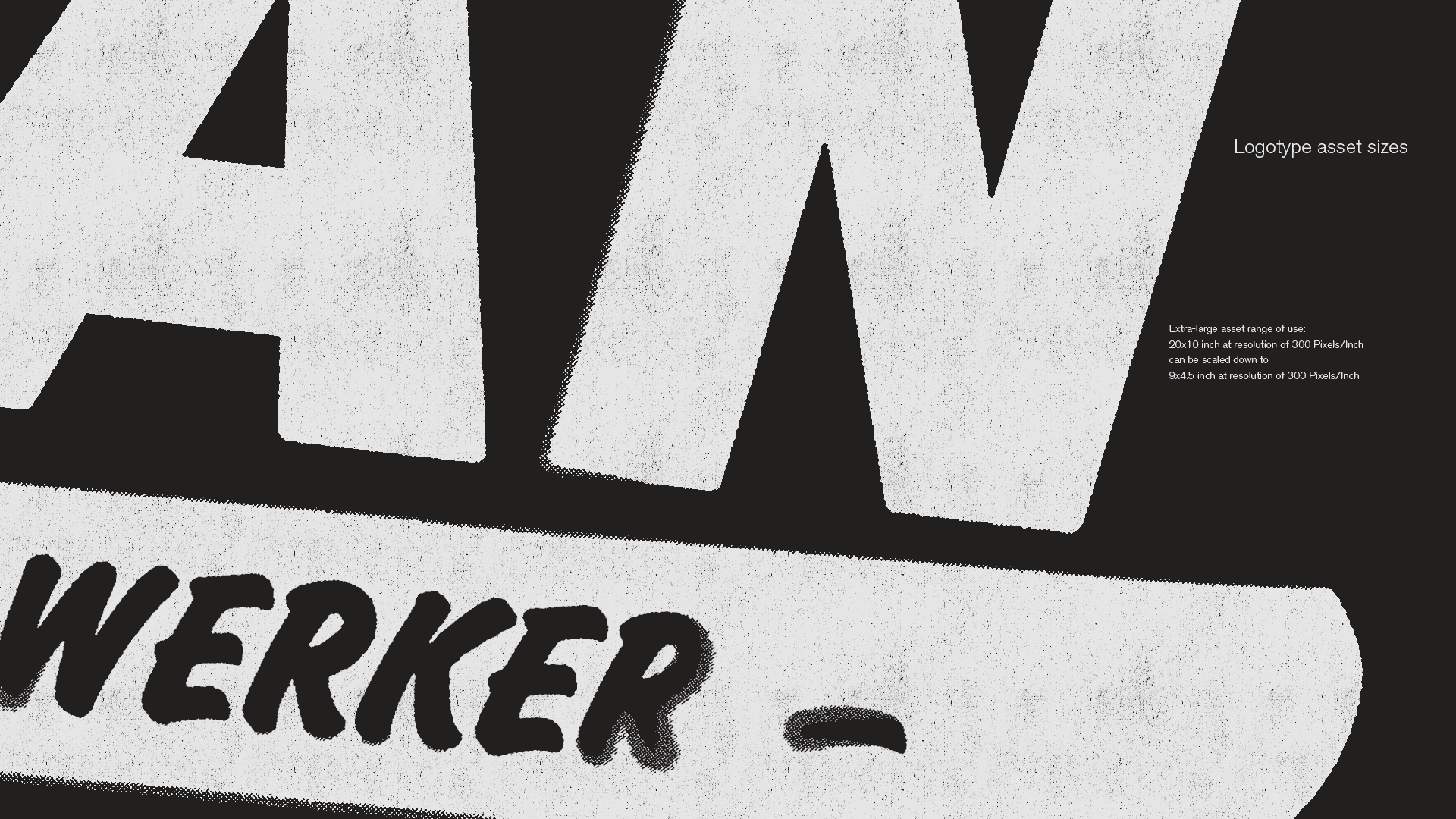
The graphic texture for the system is scale dependent. In order to maintain detail and clarity of the printed/textured ascetic, multiple final assets for the primary logotype and supporting copy lock-ups were delivered at various scales and resolutions.
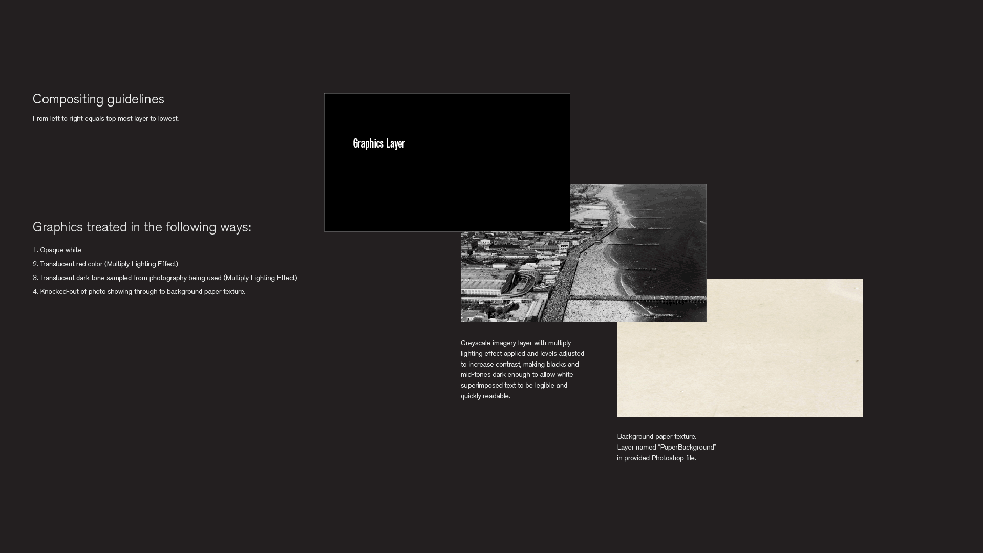
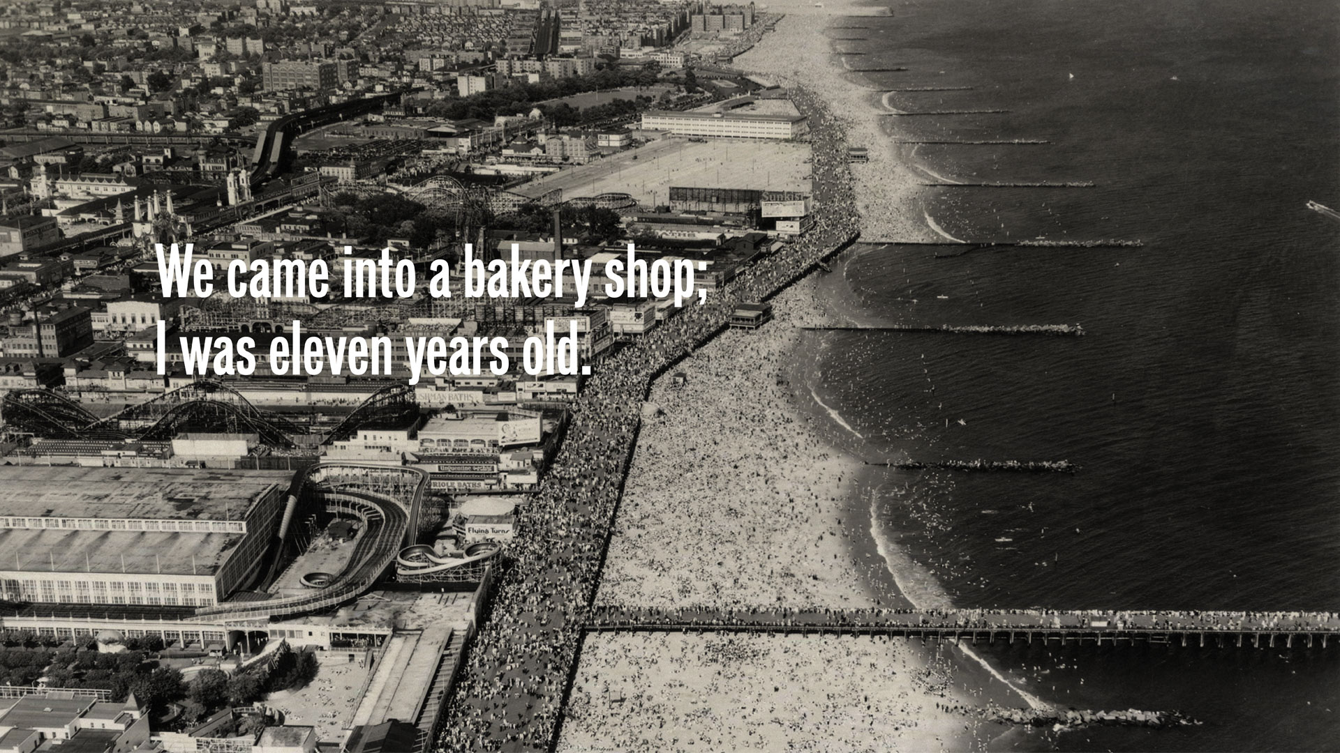
Marketing communication materials use one of three looks when composited over photos. Black and white photos are composited over a paper background texture. Iconic imagery (photos and illustrations) isolated from their background and treated with a printed halftone look. Text/graphics can either be translucent red in color with an over-printed look, or opaque white depending upon end use and what works best when composited over photo being used.
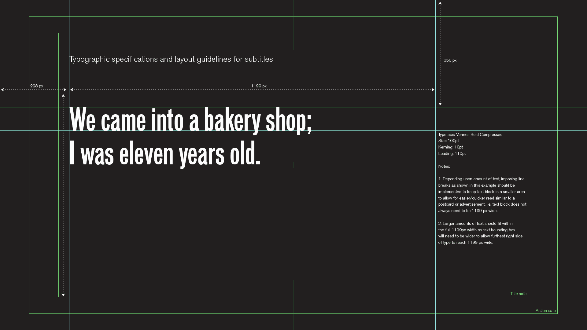
A style guide was created to promote a consistent way of design and implementation of the “Famous Nathan” identity system. This consistent visual style gives all communication materials a sense of unity and reinforces viewers experiences. The style guide document is written for graphic artists, motion designers and software developers who will be creating marketing and communication materials for the film. Both specific advice on making effective use of design assets, and general principles are covered.