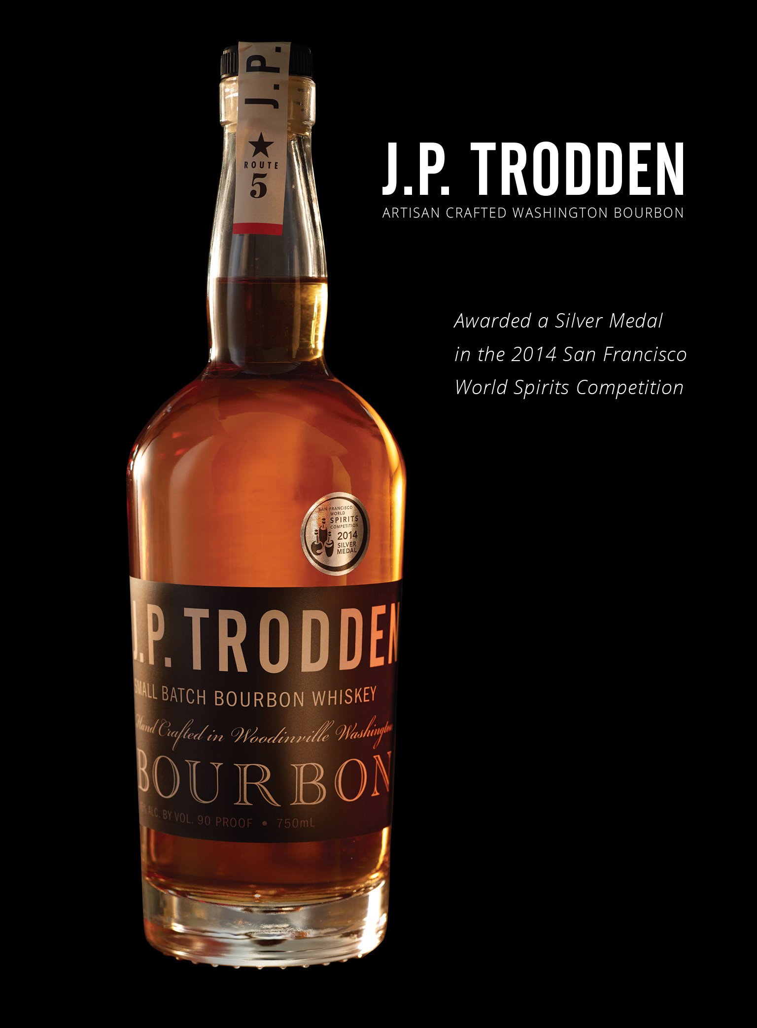
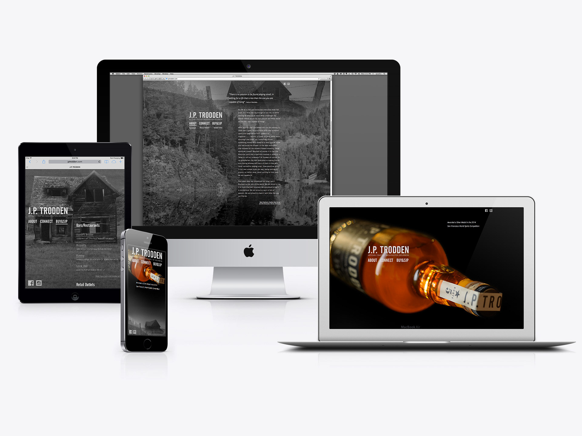
Founders Mark Nesheim and Jennifer Seversen contacted GRAPHIC HAVOC to design a website for their newly formed distillery and flagship artisan crafted Washington bourbon that was recently awarded a Silver Medal in the 2014 San Francisco World Spirits Competition.
J.P. TRODDEN expressed ideas about content for the website and GRAPHIC HAVOC provided consultation helping them see clearly that contemporary brands live a decentralized and fragmented existence. They were asked to think of their custom designed website as an anchor, the cohesive center of a hub-and-spoke model, and to consider the site to be an asset which sets the tone and standard for the brand's online ethos and attitude.
GRAPHIC HAVOC presented a point of view that great product focused websites either syndicate or point to content at strategically targeted social media outlets while still providing impactful and memorable experience. The goal was to provide a solution aimed at flexibility and agility. Rather than creating a site with an overbuilt and unnecessary CMS and publishing in-depth content which only a few thousand viewers may ever end up seeing or spending any signifiant time with, a single page website was proposed and conceived of to act more like an interactive poster rather than a multipage brochure or book. This approach is a cost effective solution allowing J.P. TRODDEN to completely refresh and redesign their site as often as needed, breathing new life and excitement into their brand's experience.
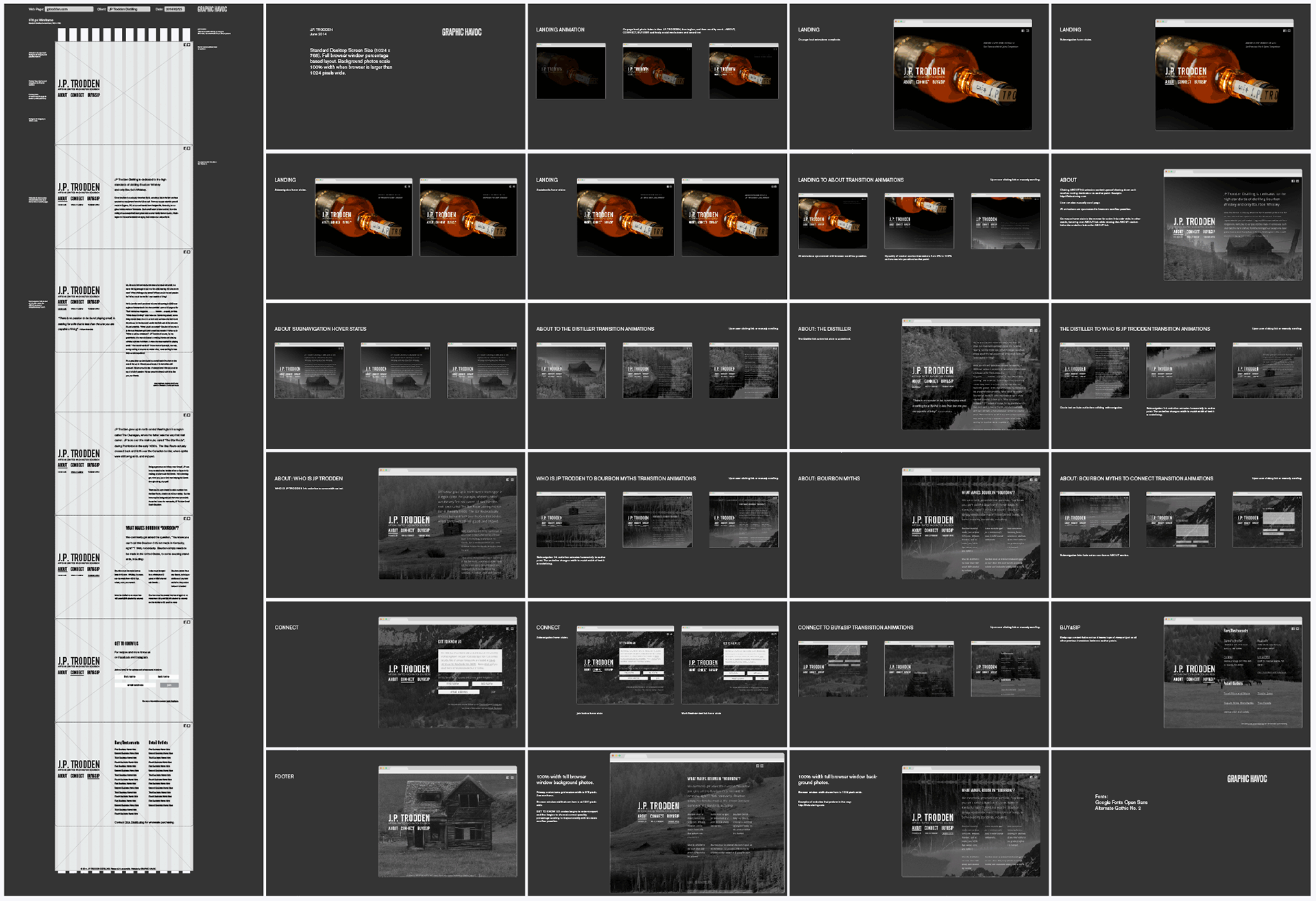
Wireframes & storyboards detailing functionality specifications.
J.P. TRODDEN being a newly formed distillery (2013) provided only rudimentary logo system and label assets as a starting point. An overall look/feel for the bourbon's identity had not yet been fully developed.
While the primary focus of the project was the website, a significant amount of identity development was set into motion. Taking an assessment of the J.P. TRODDEN brand and goals moving forward, it was clear that their current secondary messaging, “small batch bourbon”, however true of a statement that might be, was falling short in telling the story of their product. For example, Jim Beam's Knob Creek is a small batch bourbon that is packaged and marketed as such. GRAPHIC HAVOC proposed that there is a difference between top shelf and artisan crafted spirits and that this distinction needs to be reflected in all aspects of J.P. TRODDEN's branding and marketing endeavors. It was important to Mark and Jennifer that it was clear their bourbon is distilled in Washington State and that great care, skill, and love went into making it. In addition, they wanted to emphasize this was their one and only product: “We don't do ANYTHING else but this.”
GRAPHIC HAVOC suggested that the tagline had to be…

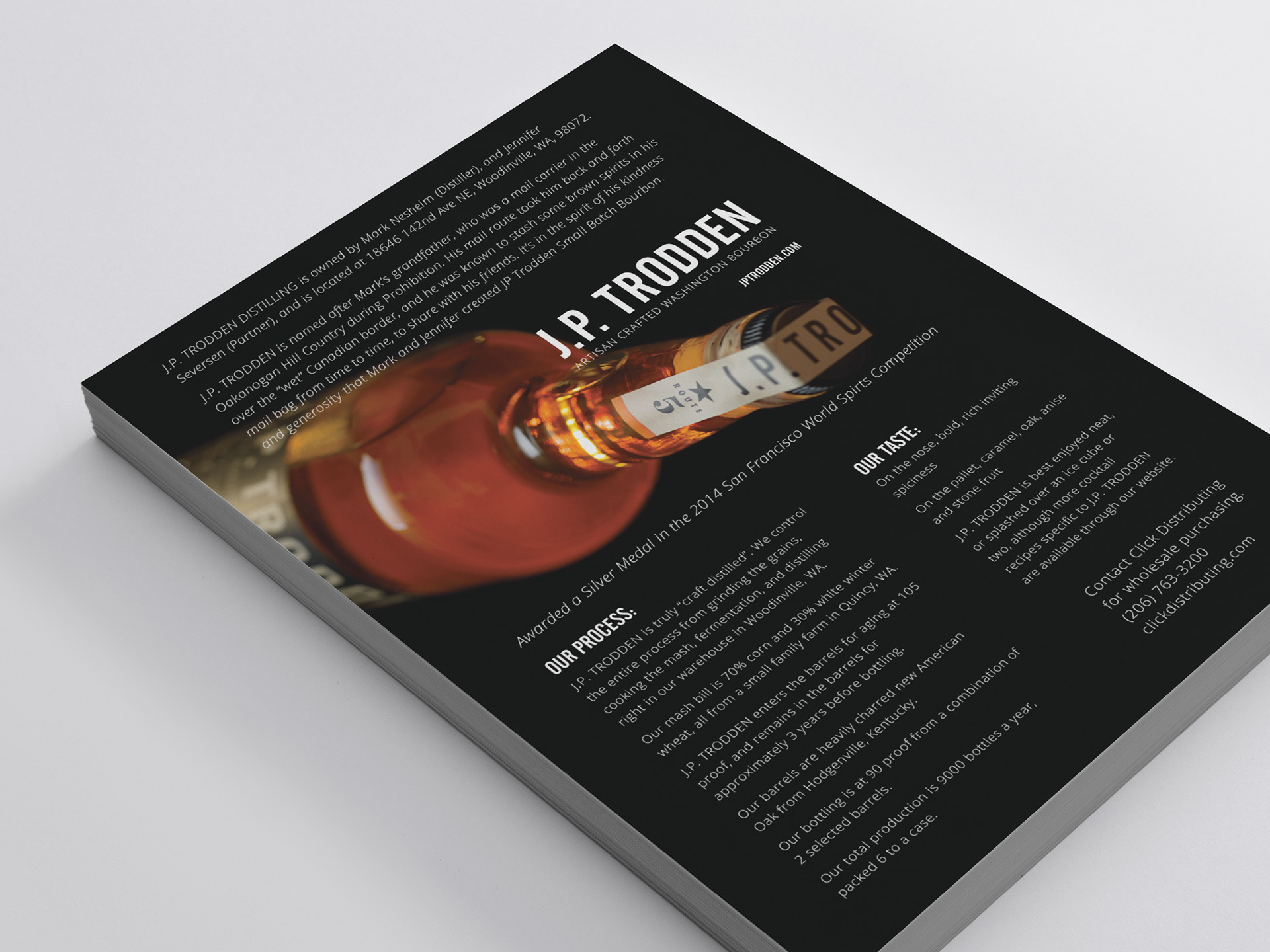
Now with the identity and messaging tying product to geographic origin, it was only right to utilize photography which was personal and local. Landscape photos were shot by Mark's brother in the surrounding areas of the distillery. GRAPHIC HAVOC helped decide on and provided art direction to Angie Norwood Browne, a WA based photographer, for two new product photos. A folded 5x7 inch sales sheet and 8.5x11 one-sheet were also designed.